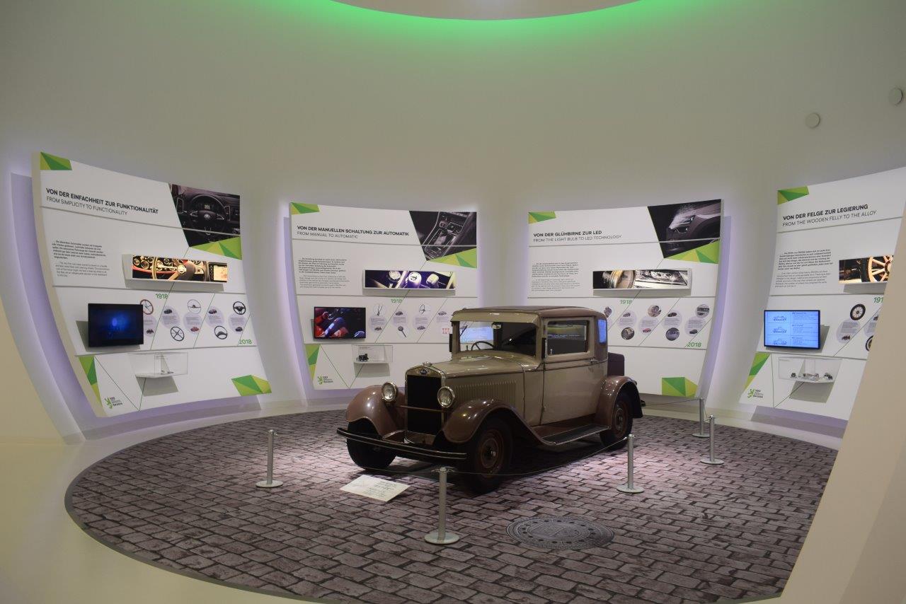
The Škoda building in Wolfsburg follows the spirit and design language of the Czech brand familiar from many car shows.
In my view, the structure reflects confidence and invokes patterns from nature. The white/green/transparent decoration works just as well with classic cars as 2018 models.

According to the leaflet, the bird’s-eye view of the ŠKODA pavilion is that of the winged arrow, that is the logo the ŠKODA brand is using since 1926.

Its architecture combines elements taken from various periods of Bohemian cultural history, and the exterior architecture is a design by Czech architect Bořek Šípek.
The total area of around 650 square metres provides ample opportunity to showcase the virtues of the Czech brand.
At its central hall, the exhibition focused on the brand values of Human Touch and Simply Clever.


